


 פרסום פרויקט
 התחבר עם פייסבוק
The article focuses on key aspects of designing a logo and presenting them.
less is more
That’s what I believe while designing a logo for a brand.
The more the noise, things becomes hard to understand just like the noise from the outside while having a conversation.
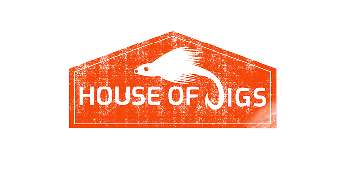
A logo I designed for an online fishing jigs seller
Creating something that is simple, picture the brand, not the logo.
Designing stationary that shows the same flow of representation
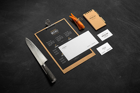
This is really important, products that go along with your brand should have the same kind of visuals.
Playing with colors
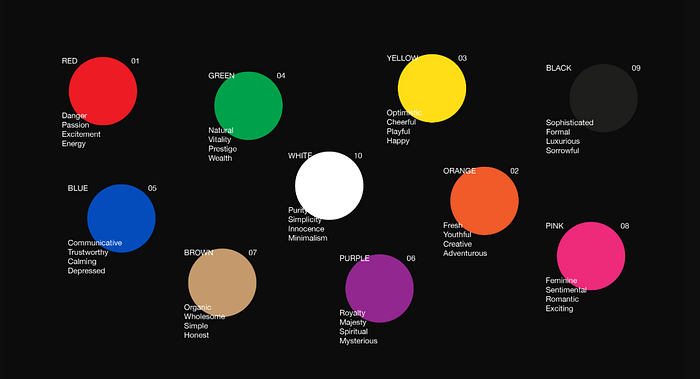
You can use colors to represent different strong points of your brand, also making sure we are not using too many colors
and making it confusing.

A logo for a local client, here red color is used to represent the important part of that visual
Proportions and Rules
Design the best damn logo, but without good rules and spacing its just a garbage.

A client who sells modern colorful carpet

A mockup of the above
Negative spacing and lots of spacinggggggggg
Sometimes negative space can be used to represent the strong point of your brand, look at the image below:

logo designed for a baby products company, products used in a way to make something out of the negative space at the center, though i’m not a great fan of this logo
Tell me what’s wrong with the image below

The spacing at the top are not in proportions also the spacing at the bottom needs some touching from sides, and i hate that email sitting at the bottom.
Something which is simple, proportional, and says what the brand needs to say

A logo a client needed to represent lord Ganesha and trust between two friends

A mockup of the above, in different color
Phew…those were some tips along with my portfolio.
If you need a logo to be designed the way I explained in this article, contacting me is always free: compilerstupid@gmail.com
lemme know what you think, maybe there are lot more to add to this article.
I-(cursor blinking, because i’m not a writer:)