


 פרסום פרויקט
 התחבר עם פייסבוק
A positive UX definitely requires a smart interface, but is not limited to it.
The reality of our modern business world requires drastic reviewing of business processes and focusing on providing excellent services for the clients. It implies the ability to adopt changes instantly and to keep optimizing the business activity in such a way that would allow to meet the customers’ changing needs. The clients’ expectations regarding the quality of services are constantly growing, especially when the clients are Millennials. High-grade services are nowadays expected by default. No matter whether we are talking about the bank credit, online activation of certain services, collecting of disbursement information, purchasing of goods or getting a consultation – whatever it is, customers want to have it right here and right now on their devices. Their time is precious, so the feedback needs to be instant, the application interface needs to be easy and understandable, and any interactions should proceed in a clear and plain manner. A user-friendly interface of informational resources, the availability of online-chats, an individual approach – that’s the world that people are already used to. To suit these criteria, successful enterprises do their best when they design their site or mobile application.
To improve the User Experience (UX) of their eCommerce products, thriving companies strive to distinguish themselves from their market competitors. Of course there is also the option to simply follow current general trends and just present yourself in the same manner as others do. Nonetheless, those who want to stand out from the crowd, take a thorough approach to this issue, and as a result they become a provider of unique goods or services, and yet still stay in unison with the market trends.
Even when the eCommerce industry keeps its finger on the pulse of the modern digital trends, which are about sufficient satisfaction of clients’ consumption preferences, e-trade-platforms still offer many details that ought to be improved to bring out the positive UX. Many sites are still providing only small-sized pictures of their goods, which irritates visitors and robs them of the opportunity to make a visual acquaintance with the product. We all know that one good photo of a product can replace thousands of words and consequently earn you thousands of dollars. As they say: “it’s better to see once than to hear a dozen times”. Thus the visuals of a product presentation are truly important.
A good example of an informative tool is a video review, or so-called “unboxing-video”. The main advantage of such a product presentation is that a potential buyer can see what he will actually get if he makes a purchase. Advanced eCommerce companies keep this in mind and add links to such video reviews into their product description.
Speaking of the technical side, progressive companies make sure their website performs fast, because if it doesn’t, then all the best products and services and the supremely attractive design of the page will be in vain, as nobody wants to waste time in annoying suspension.
But let’s get back to the question of a user interface that brings about a positive UX. As a matter of fact, the simpler the interface is, the more understandable it gets, while a cluttered interface can only perplex the page visitor. So, the time invested in planning a clear and convenient structure of the resource is well spent, since this is the only way to ensure comfortable “travelling” for the user.
Interface is a shared space between a user and a system. It helps the user to explain what he wants, so that the system could provide it. Obviously, if no understanding between human and machine is reached, the human will simply leave the page and not return. Some people quit if they don’t like the design of the page, others – if they are expected to take many active steps (e.g. clicks) in order to find what they’re looking for; and if someone had difficulty in using a resource the first time, he is unlikely to choose this service in the future.
As we mentioned in the beginning, millennials expect great usability of the services. In most cases however they are able to get what they need, even when trapped in an absolutely disordered e-stage. They understand and feel how the internet environment works, because they have been involved with the digital space since their birth. But what about the Generation X representatives? Is it just as easy for them to swim in that digital sea, looking for the hidden streams? Definitely not. Of course, there is a good bunch of Gen X representatives, who could outdo even some Millennials, but most of them face serious bewilderment when it comes to an ambiguous interface.
At the same time, there are situations when a web-design is suitable and convenient for the young-aged audience, yet totally incomprehensive for the older one. What do most companies do in regard to this problem? Usually they focus on their target audience and construct the site around its preferences.
But let’s have a look on one great example how a worldwide known online marketplace and hospitality service company Airbnb found the way to create a user-friendly interface for both inexperienced and experienced users.
They set up two landing pages. Both were developed in a single corporate style, but with the content that is different for the first time visitors and those that have been there before. For the first visit, the site directs a guest to the landing page where general information about company’s activity is described in a short and comprehensible manner, so the guest can quickly decide if this is what he was looking for. If it is, the visitor starts using the services which the resource provides. The next time around he would be directed to the more content-saturated landing page, which allows him to start an immediate search for the necessary information. This is exactly how a go-to UX solution should look like: a client gets a perfect tool for his needs and wastes no second in contemplating how it works.
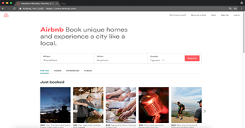
Pic. 1 Airbnb landing page for the first-time visitors.
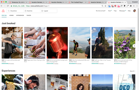
Pic 2. Airbnb landing page for the returning visitors.
This “Welcome”-solution prompts a visitor to consider whether he has come to the right place and if he would like to stay. The introduction stage is like an entrance hall for the site visitors, and the successful customer-centric companies always tune their “hall” precisely, so that the “passengers” would be delighted to get onboard of their “service plane”.
The next significant step would be to make the flight comfortable. That’s why the companies pay close attention to minute details and furnish their webpages as cozy and practical as possible. Heuristic interface – that’s the key to unleashing the ultimately positive UX.
And of course, the truly xenial eCommerce courts would never forget to ask visitors about their wishes, comments or proposals concerning service quality, regardless of whether they made a purchase or not. Creating the really pleasant and sincere “Hello” (Introduction stage) and “Goodbye” (Fade stage) phases helps to level out some small flaws of the site that could be practically unavoidable as it is nearly impossible to design the page to everybody’s taste.
The eCommerce companies who follow this concept, ensure the maximum customer flow leading to the high sales rate and high revenues. In addition to happy and satisfied customers, who would gladly return the next time the services are needed, these companies also obtain an auxiliary and absolutely free advertising channel. Word-of-mouth marketing system is a really effective way of expanding the client base. When your friend tells you how safe and easy it is to use a certain service, you have no reason not to trust him. He isn’t selling you anything, but is simply sharing a pleasant experience he made with an eCommerce company.
As a brief summary, we can conclude that a positive UX definitely requires a smart interface, but is not limited to it. So it is obvious why the leaders of the eCommerce industry take such a responsible approach to developing an interface and why they “dress” their web-pages in cool suits, as to encourage visitors to enter and stay. The point could be also described thus: people get hungry around well displayed food. So, companies make sure their websites look appetizing and offer delicious dishes.