


 פרסום פרויקט
 התחבר עם פייסבוק
 התחבר עם LinkedIn
I want to share with you my experience from the last year, of working on the new Design System for for the Micro Focus organization. The entire journey was one of the most complex, challenging and fascinating processes I took part in, and actually I can say, that it was a fulfilment of a personal dream.
Since the beginning of my career as a designer, almost 20 years ago, I aspired to be part of something big and significant, a challenging design process that will cross the boundaries of where I work, and reach and touch masses of people around the world.
This year it happened! The merger of HPE Software, where I worked with Micro Focus., made me part of the world's seventh largest software company.
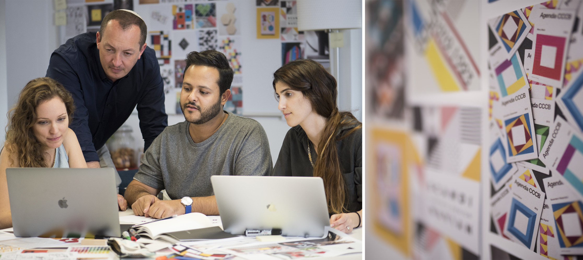
As the Pan UX Group Principal Design Manager in the organization, I led, together with a talented group of UX/UI designers and with the guidance of my manager, Oded Klimer, the Chief Design Officer, the rebranding process of the merged company. We have developed a Design System that will support our company’s portfolio of more than 240 different products.
This is the proper time & place to thank each and every one of the Studio Designers, who made their contribution to the process. Especially those who were by my side all along – throughout the rises and the falls: Eldad Tzadok, Lital Tal, Galit Bar Fuertes, Inbar Sheffer, Ortal Goma, Maya Dinur Cohen, Adi Berda, Mor Goldstein, Gili Miller and Nitzan Shorer.
It is important to note that although this is a process that was aimed at rebranding a giant enterprise company into a new graphic language. However, the insights I will share with you in this article apply to any size of a company
To walk you through the fascinating journey, which took place over 10 intensive months, I will break it down to key steps I took to take the design from vision to implementation
Formulation of scalable design principles
The first step was to fully understand the ecosystem for which we were about to create the new graphic language.
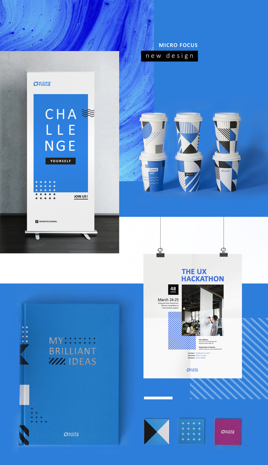
The starting point for the new design language was based on the existing design Micro Focus had a design that was based on the typical characteristics of an enterprise company. It was a balanced design that supported a big portfolio of products but nothing exceptional. This for me was a one-time opportunity to break the boundaries of the Enterprise world and introduce a younger, dynamic and convention-breaking visual approach.
One of the core challenges was to create a new language that would break out of the existing boundaries of the brand but, without creating a disruption with our customers, employees, and development.
We started by defining ‘What does the company convey? What are our values? What is our message?’ Taking what leadership thought and listening to the feedback employees and customers had. We asked questions such as "How would you like to characterize the company you work in? What kind of company is it? What are the company’s strengths and weaknesses?
The feedback we received ranged from: innovation, breakthrough, granularity, the ability to match the solution to the customer, onto reliability, stability, greatness, and strength.
We took all the feedback and sentiments we received and refined it into three abstract values: linked, reliable & strong That when translated into visual design elements became:
- Sharp
- Modular
- Bold
These three core values and elements became the foundation we later based our design decisions when defining our new graphical language. Once we had the foundation closed down we were able to start articulating these values into a clear graphic language which reflects them.
Diving into in-depth work
Formulating the color palette
As part of the redevelopment of the brand and the desire to create a unique identity for the organization which will differentiate it from dozens of companies operating in the same space, we sought a way to enrich the palette and adapt it to the needs of the software world, which mainly maintains user interfaces.
Based on a basic color palette that already existed at Micro Focus, we created and designed a rich color palette of saturated colors that match the values of the brand we defined on the one hand, and on the other hand, chose colors that can fit into a user interface that needs to support screens displaying multiple infographic contents, without causing a cognitive overload for our end-user while working with our applications for multiple hours.
As a result of the process, seven main colors were picked and refined, among them the leading brand color, four status colors and 24 secondary colors designed to provide maximum flexibility in response to the need of displaying the required infographic content in the company's products.
Formulation of the organizational hierarchy
Another challenge that we faced was the immense portfolio of products in the newly, merged company's portfolio, that topped 240 products! This required us to establish an organizational hierarchy. According to this hierarchy, dozens of products from the portfolio were concentrated and divided into 9 core "Families of products” that represent the different facets of our rich offering.
Our key task was to reflect this hierarchy at the graphics level, based on the values around which we have set ourselves, was the first thing we took on. The aim was to distinguish between the levels of the organization; family (business unit) and product, while preserving the affinity in their identity.
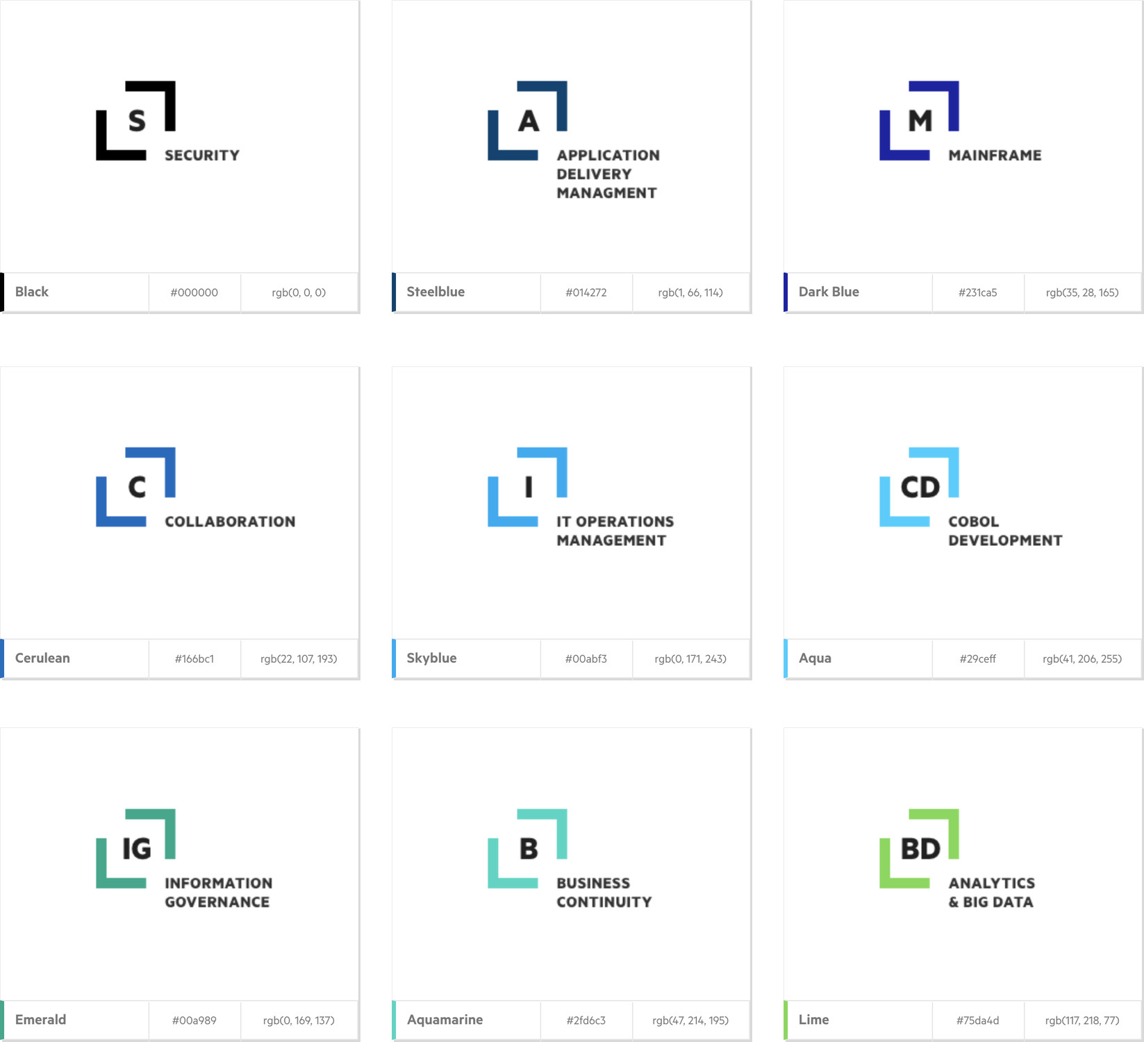
From a brand equity perspective, the decision was to maintain the Micro Focus's logo emblem. We felt it was important to preserve the visual connection between the company logo, the families emblems, and the product abbreviation identifier. It was clear that these symbols would be a derivative of the company's logo emblem and be inspired by it.
We achieved this by designing a symbolic pattern for the family and product level that inherits elements of the brand emblem as well as created a clear color coding that will, on the one hand, enable a differentiation between the different families and on the other hand emphasize the richness of our portfolio.
From my past experience, I knew that creating and maintaining a uniform and clear language of symbols representing 240 products (which would often say nothing or be identical to one another) is fundamentally wrong. We, therefore, decided to adopt an ‘abbreviations’ approach, i.e. the definition of one or two letter representing family and two letters representing the products. This concept enabled the delivery of a scalable solution, which, on the one hand, simplifies and creates a structured system in which we can clearly discern between the different products while visually creating a unity.
Although the concept of ‘abbreviations’ is a prevalent concept in the software industry, we have been able to provide graphic uniqueness to the family symbols in our organization and to create a dynamic icon pattern that contributes to the modular perception of language and of the organization.
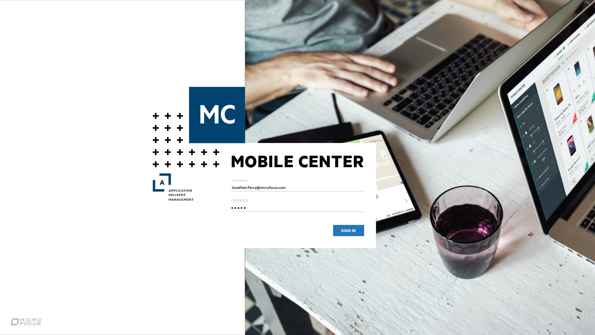
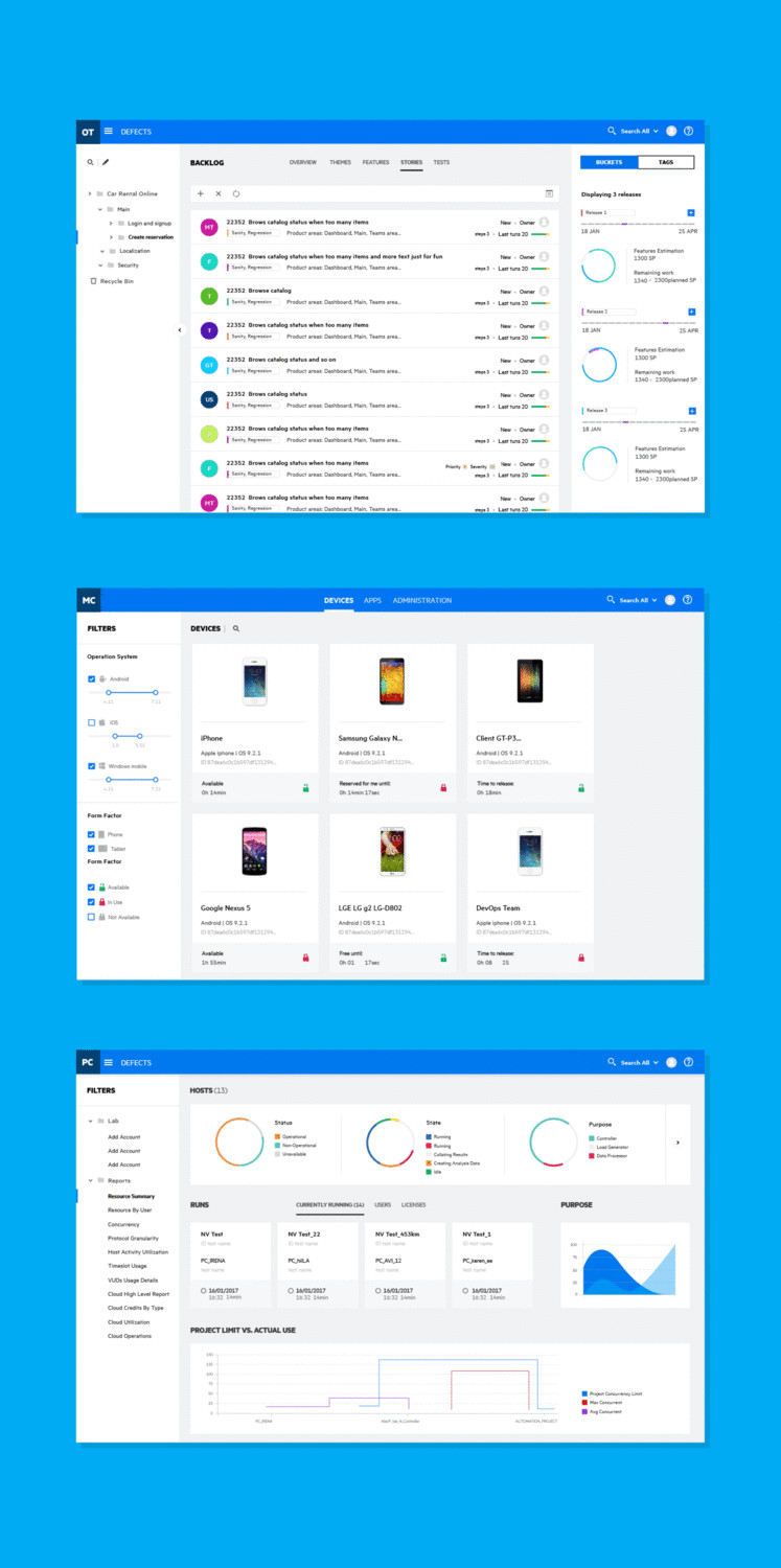
After defining the symbols, we defined the visual hierarchy and it will be reflected in the products. For example, in the illustration below – The login page:
Formulating the design principles
Unlike specific ad-hoc design, good as it may get, a Design System is a broad design platform designated to provide a comprehensive, scalable and transverse graphical solution for both, the company's marketing needs and its UI needs. This solution must come in conjunction with the tools and with the implementation of the design principles that will guide the teams in the organization in building the products consistently and uniformly under the same language.
Formulating the graphic language reflecting the values we agreed upon was the main step in building the design system. Of the three directions suggested in the studio, I decided to follow the direction of the designer Eldad Tzadok – a design direction that was characterized by bolder lines and a strong and uncompromising character and freshness. A design that will highlight and differentiate the company in a world of corporate design.
In spite of being a dynamic and modular language, it is built on the concept of a strong and stable grid on which the elements are placed, in seemingly random bulk, stain, line, typography and various graphic elements – powerful identity components that define the language and support the leading values of Strong, Reliable & Linked.
Dismantling and assembly towards formulating the UI language
Another feature of the Design System is the creation of a library that incorporates all the design elements, such as color palettes, templates, modules and various UI components. In order to compile such a library, we first had to examine how the language we created would be reflected in the user interfaces of the products themselves.
From the very beginning, it was clear that translating such prominent visual identity into the UI language would be a big challenge.
We focused on creating a positive and calmed down user experience, without compromising the essence and the identity-quintessence of the language.
As a first step in the process, we reviewed and braked into factors the user interfaces of the various products in the ç. Based on this review, we began to develop UI layouts, templates and interface models that will include all the different navigation and content areas, and will serve as the broadest possible common denominator for building the Style Guide and the library of components.
Based on this "common denominator", we defined UX/UI principles such as the structure of the content layer in the interfaces, Grid, UI Structure, Shadows & Elevation – all the basic and essential elements in order to maintain uniformity and consistency among the various products.
In order to test the emerging interface-language, we tried it on a set of sample products. These tests helped us to validate the language on real interfaces and refine the design of UI components in order to define the legality of the behavior of all the components in relation to each other.
The more we "spoke the new language", the more we applied it to more examples, the better the refined and new character of the company could be traced, the stronger was our impression and conviction that the graphic language is actually firm and stable and is indeed sufficiently scalable to provide for the entire needs of the organization.
Turning the language accessible to everyone
The final landmark of the Design System creation journey is the Style Guide.
The Style Guide contains all the definitions, rules and instructions for implementing the graphic language.
In order to communicate the language in a transverse manner to the different groups in the organization which are eventually supposed to realize the new design in the products they are developing, we have built a website with a detailed explanation of the fundamentals of the new language as well as a library of components developed in the three main programming languages, React, Angular and Bootstrap, combined with three leading development groups in the company.
By doing so, the new language has become accessible for all the product managers and developers, thereby minimizing the amount of duplicate work for the various development groups.
This is the place to express my gratitude to those who drove the development process: Carsten Schlipf, Rebecca Wurster, Ibha Gandhi, Donna Marijne, Andy Reid, Roland Penny.
This entire journey was one of the most complex, challenging and fascinating processes I took part in. Actually I can even say, that it was a fulfillment of a personal dream.
Take a look at the Style Guide website at: m.everythingux.net
Please feel free to write your comments, thoughts about to the article in the comments section, or by email: Reuven.yamrom@microfocus.com